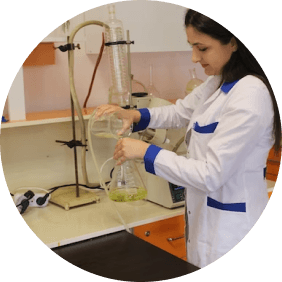
SOCIAL
Conecta e Innova Tacna
The digital platform that boosts the entrepreneurial ecosystem of the Tacna region.
Client

Tacna Innova
Project Owner

Paulonia
Team
2 designers
Timeline
4 weeks
Role
UX
UI
Testing
Design QA

Figma

Photoshop

Maze

Useberry

Jira

Slack

Loom
Methodologies
Atomic Design
Lean Kanban
Design Thinking
Usability Test
Devices
Web
Mobile
About the Project
Conecta e Innova Tacna is a website created to promote innovation and collaboration, primarily in the Tacna region of Peru. The website offers resources and tools such as spaces for project exhibitions, calls for proposals, contests, consulting services, training courses, and learning paths.


Objective
The main objective of Conecta e Innova is to create a dynamic and collaborative environment that promotes innovation and entrepreneurship in various fields. The website aims to:
Facilitate the connection between entrepreneurs, advisors, researchers, and students.
Promote the development of projects.
Promote continuous learning.
Increase the visibility of projects.
Promote collaboration.
UX phase
I analyzed the client's requirements and conducted user interviews to define the functionalities.
I conducted a benchmarking of similar products to understand the market landscape.
Based on all the information from interviews and benchmarking, together with the team, we ideated the sections, user flow, and wireframes.
Throughout the design process, I participated in meetings with the client to validate the design and receive feedback.
Simultaneously, I coordinated with the development team to ensure the viability of functionalities in the design.

Website architecture
UI phase
Given that the website had multiple modules and it was necessary to ensure quality and consistency in the interfaces, I took the initiative to design components and define styles as part of a design system.
I created the style guide, color palette, typography, iconography, UI components, and graphic resources.
I designed the web interfaces with a responsive approach.
Color palette
I started by reviewing the Tacna Innova brand manual for the color palette.


Typography
Lexend
I defined the styles in Figma for each text type, headers, buttons, body, captions, etc.

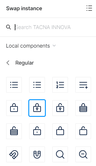
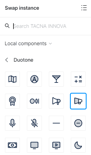
Iconography
I used the Phospor library for its wide range of icons, choosing Regular for standard elements due to its clarity, and Duotone to visually enrich key components.
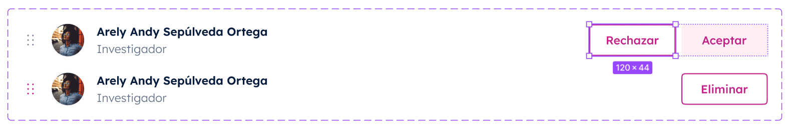
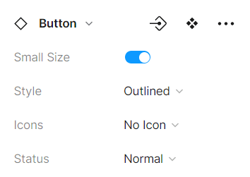
Components with variants
I designed variants for each component to maintain consistency throughout the design. Here are some examples:
Buttons

Avatar

Texts fields

Rich Text Editor


Components in Figma and their properties
I configured each component in Figma to facilitate its use and access. Here’s an example of its use:
Inicio
It contains an introduction and a call to action to explore all the sections of our website.
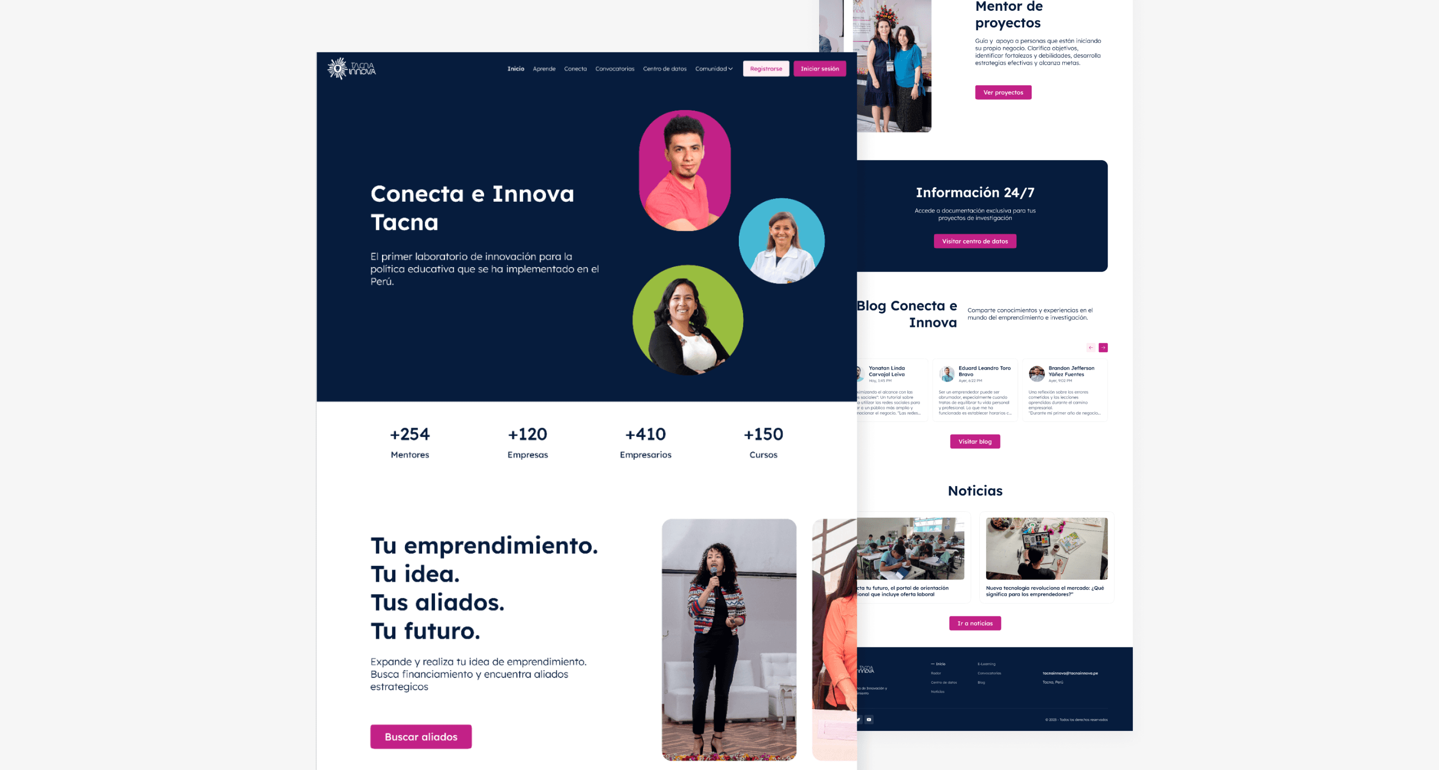
Home
Aprende
Users can follow learning paths, access courses, and earn certificates to advance in their educational development.

Learning Paths
Conecta
Users will be able to discover projects and people based on their location, thus expanding their networking and local collaboration opportunities.
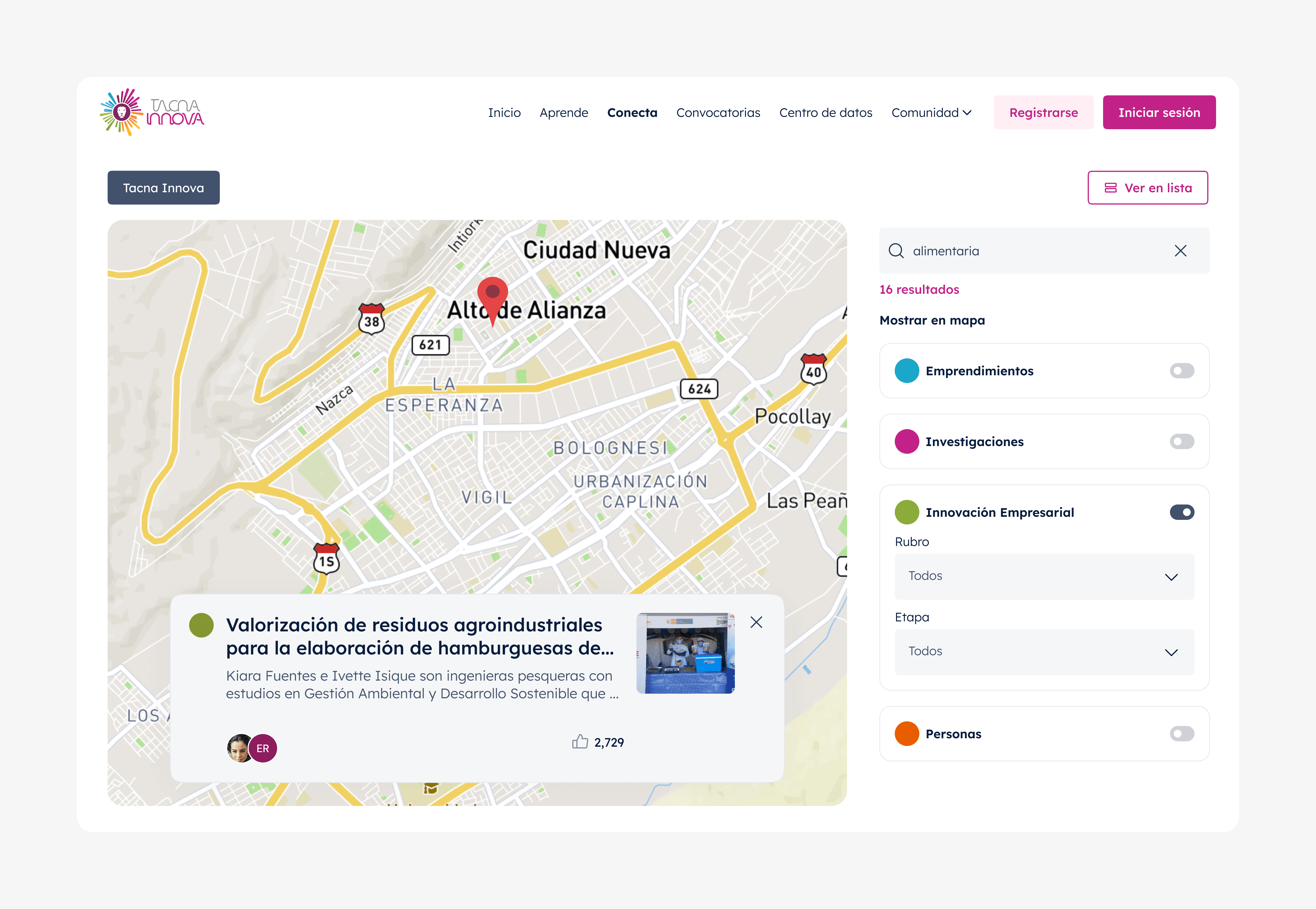
Conecta Section
Business Innovation projects
Users can share their entrepreneurship, business innovation, and research projects, as well as collaborate on others.

Business innovation project
User profile
In each user's profile, their associated projects and consultations will be displayed along with contact information, allowing for direct communication.

User profile
Comunidad/Blog
Users can share on the public blog, where they will have the opportunity to interact with other community members and engage in discussions.
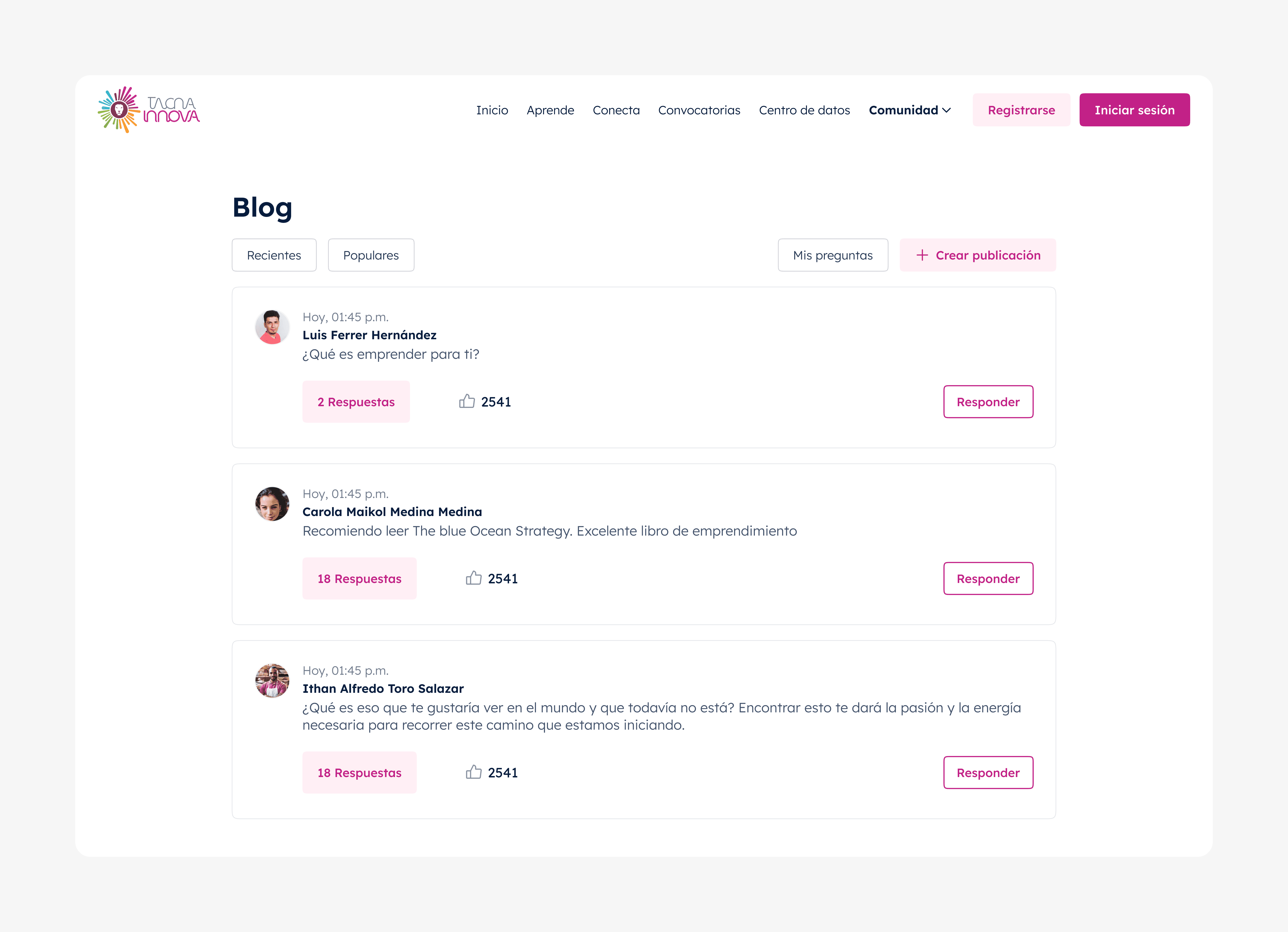
Blog section
User testing
Resources
Prototype, script, tasks and scenarios.
Type of tests
5-Second Test, A/B Testing, First Click Test, Preference Test and Guided Sessions.
Metrics
Efficiency, effectiveness, satisfaction survey and heatmaps.
Insights and Solutions
First insight
In the 'Conecta' section, where we showcase various entrepreneurship, business innovation, research projects, and people, most users had difficulty navigating.
Identified issues
Map Relevance: Seeing the information on a map was not relevant to the users, as location was not a limiting factor for making connections.
Interaction with Pins: Having to click on each pin on the map to see the details of a project or person reduced users' interest in continuing to browse or discover more projects.
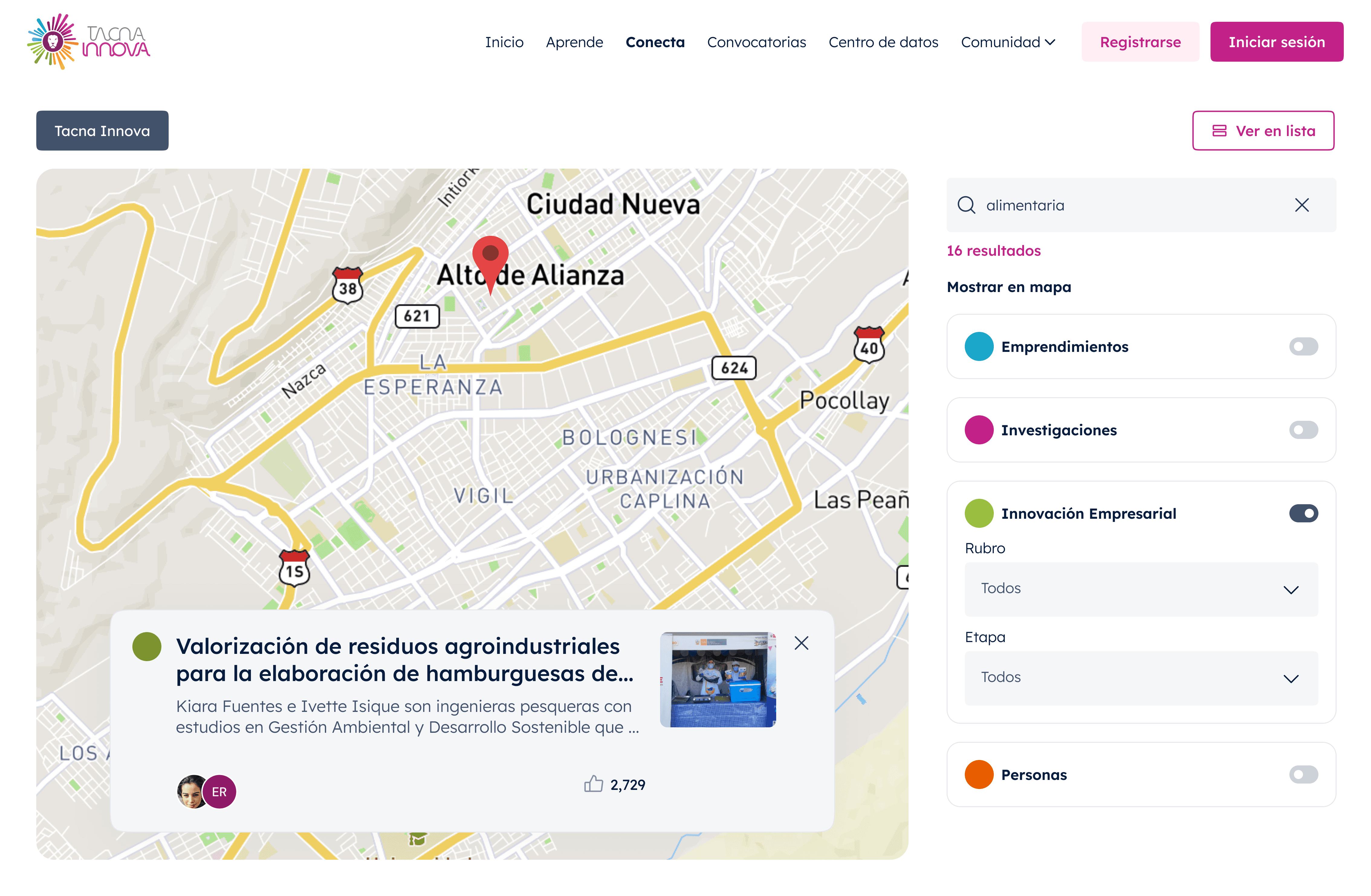
Conecta Section - Before
Solution
Conecta section in the Navigation Bar: We moved the concept of the "Conecta" section to the navigation bar. Now, people and projects have been organized into new modules: "Comunidad" and "Repositorio," respectively.

Navigation Bar - Comunidad Section - After
Navigation Bar - Repositorio Section - After
Comunidad Section: All users registered on the platform have been moved to a specific section called Comunidad. This allows users to find and connect with other members in a more organized way.

Comunidad Section - After
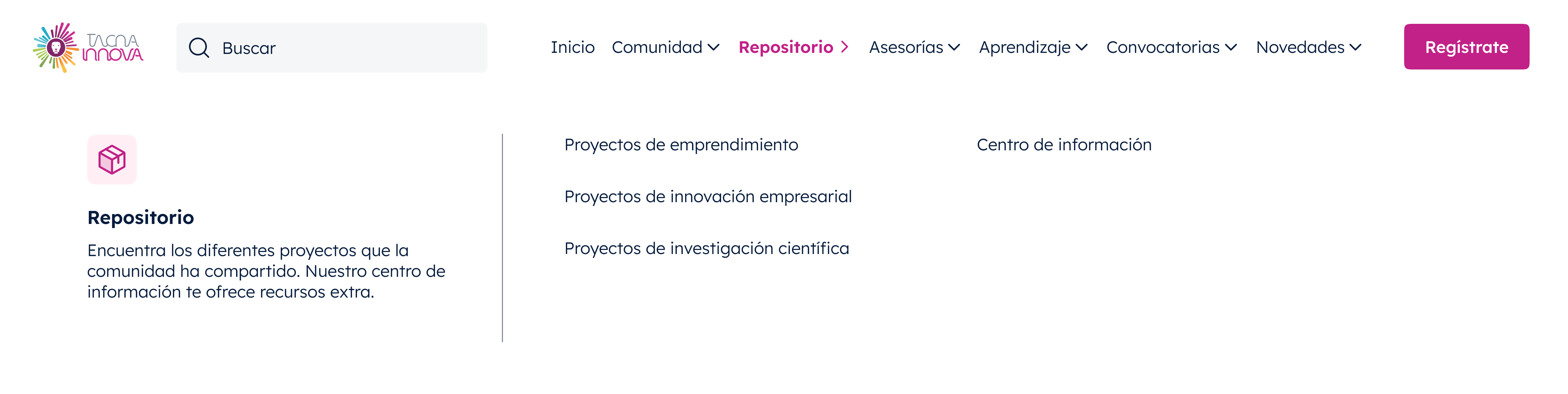
New Repositorio Section: We created a new section called Repositorio, where all types of projects are grouped. This section centralizes all relevant project information, making it easier to search and access.
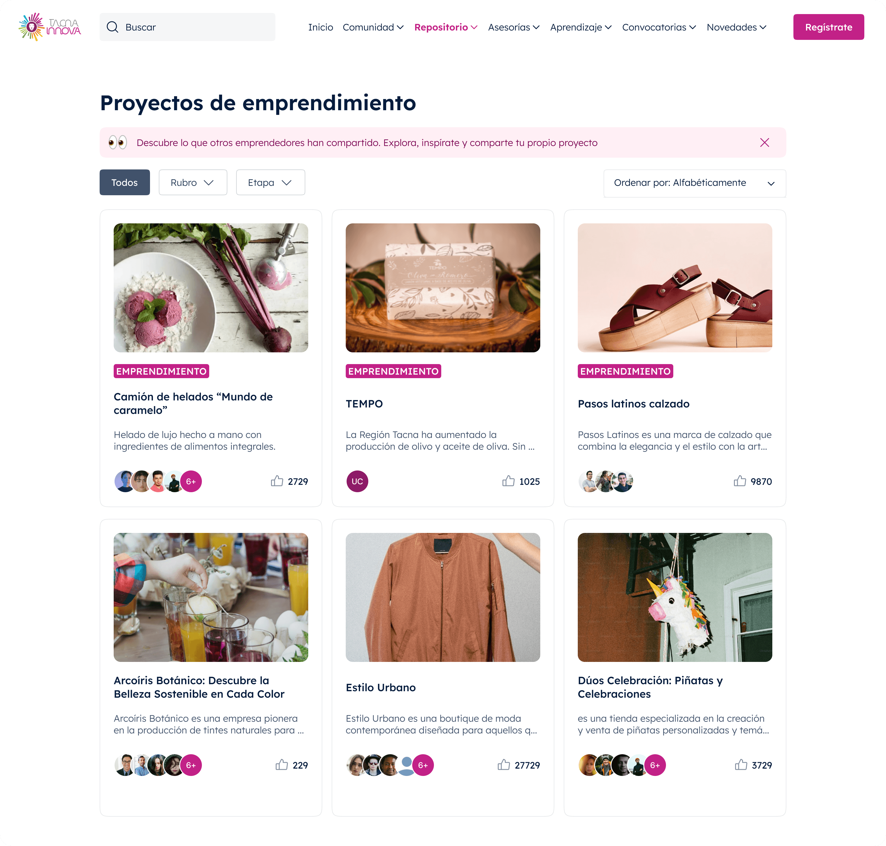
Repositorio Section / Proyectos de Emprendimiento - After
Asesorías Section: We created a section dedicated to Asesorías, where all the consultations registered on the platform are housed. Previously, these consultations were only displayed on the profiles of the people offering them, but tests showed that users needed to see the consultations in a single section..

Navigation Bar - Asesorías Section - After

Asesorías Section - After
Second insight
Information on the Main Page: Some users, during their first visit to the main page, had to revisit sections to discover the information, which took extra time and was not entirely clear.
Home - Before
Solution
Home Redesign: We redesigned the main page to make it more user-friendly and easier to understand. Now, we highlight who the users are and their roles, as well as the projects, making them more visible. We also improved the text in each section to make it clearer and better organized.
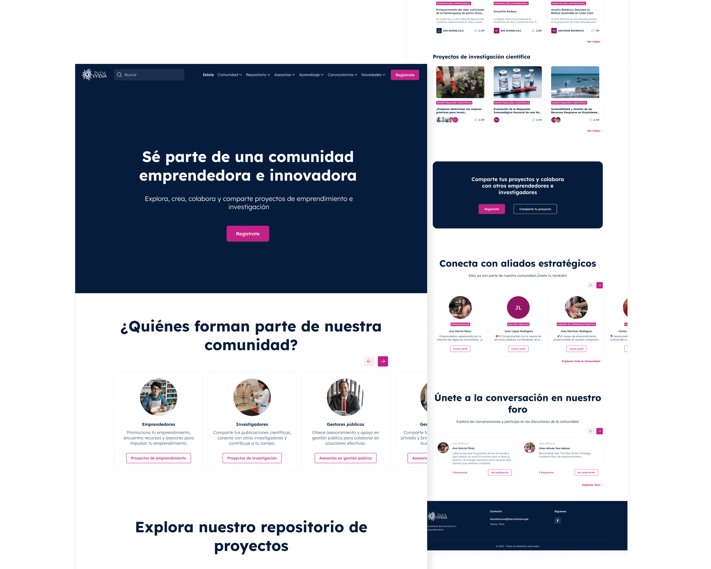
Home - After

